Letter Spacing Guide to Design your Website – Best Web Design Company in India
Isn’t a beautifully designed webpage allures everyone? Your website is the face of your online business, so it is important to make it appealing and practical at the same time.
Let’s make it more colloquial- if only given 10 minutes to consume content, chances are high that around 60% of the audience would prefer some alluringly designed webpage to something blatant and plain. We need to understand that while in cutting edge competition time is money, and it is crucial to engage consumers with the very first impression. We are the best among website design companies
So, if your website is outdated chances are high that your online presence would get outdated soon. Now, in addition to many other features of webpage designing, Web Design Company pay attention to the visualization of the content, which plays a central role.
Most of the information given on a website is consumed through reading, so it makes a lot of sense to pay special attention to the placement and spacing of the letters and words. Typography, in web designing, is more of an art form than technical. Including many other aspects of typography, “letter-spacing” is the one that enhances the quality of websites.
Letter Spacing- the lucid art of enhancing text legibility
Letter spacing is nothing but the logical way of spacing the letters so that they are easily readable. It is a science that we read only the first and last letter of a word to comprehend it. So, if the spacing between them is too large or too small then it may get hard for the readers to comprehend, and they may have to spell out the entire word, which can be painstaking.
Significant
Significant
S i g n i f I c a n t
S i g n i f i c a n t
Hence, while design websites one needs to understand how letter spacing can be corrected. The CSS parameter “letter-spacing” could come for the rescue in this case, as it can be used in headlines with a font size of (minimum) 24 points.
Another way of enhancing the readability of headlines is through “spaced text”, which means significantly increasing the spacing. This technique can make your text stand out from the crowd, and add a proper flow to the content of your website.

The holy purpose of letter spacing
Now, why any web web design company should put their attention on spacing letters while designing their website? Isn’t just formatting them as per the default font styles enough? The answer to these is perhaps “NO”.
To make your website stand out, and increase its traffic, you need to give a first-class treatment to the typography of your webpage while designing it. Practically, the appearance of the texts strikes the eyes of the readers even before they decide to read them. So, proper letter manipulation makes sense!
web design company believe that readability should come before anything else. Stating this, the sole purpose of the letter spacing technique is to make the content of the webpage refined and as easy to read as possible. So, even when a word may look good to you, there is a need to follow the letter-spacing principles to make it practical for the audience.
The Do’s and Don’ts
While studying letter-spacing you are likely to come across a quote by the famous designer Frederic Goudy, who stated that “Anyone who would letter-space lower case would steal sheep.” Essentially, it meant that anyone who tries to manipulate letters without knowing the rules is surely going to end up bad.
Taking Goudy’s quote in a positive way here are some of the do’s and don’ts that could make it easy for web design company to apply the art of letter-spacing:
DO- Do not put all or a lot of your text in caps. But if you have to, like in headings or short titles, then add a small bit of letter spacing. Don’t forget to just give a touch-up.
PRACTICAL WEB DESIGNING IS NECESSARY
PRACTICAL WEB DESIGNING IS NECESSARY
DON’T– Don’t add too much letter spacing in uppercase texts.
THIS IS WITH TOO MUCH LETTER SPACING
| Letter Spacing |
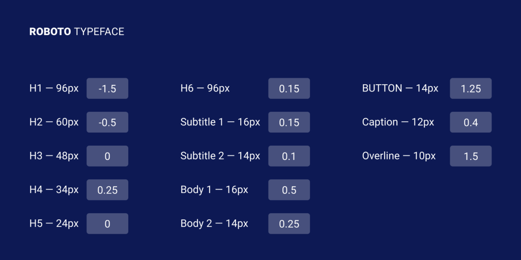
DO-While using a dark background with white text, try to increase the letter spacing to make it appear less tight.
DON’T-Do not compress the spacing of letters without any good/ logical reason.
DO- While working with small text, do increase the letter spacing, especially if the size drops under 16px.
The Final thought
One thing that can be done to enhance one’s typography skills is to look at the works of other designers. You may notice some critical nuances in their way of handing the typography, which may be of great help. Or else, you may refer to a web design company like CodeBuzzers who have extensive experience in handing typography. They have an active 24/7 online team to take care of all the needs of website designing.


